We, the people, have made it clear that we don’t want smartwatches. They, the watches, have been available for more than a year, courtesy of titans like Google, Samsung, and LG. But so far, the only wrists bearing them belong to former members of high-school A/V clubs.
Apple has the nerve to think it can do better. It believes it can make the smartwatch a mass-market phenomenon, much as it did with digital music players, tablets, and touchscreen phones.
A lot more is riding on the arrival of the Apple Watch than how you’ll use it to check your incoming text messages. The Apple Watch is the first truly new product from Apple since Steve Jobs died. Millions of people have been asking since then, “Can Apple still make hits without Jobs?”
We’re about to find out.
Three new strategies
The Apple watch is many things. It’s a timepiece, a fitness tracker, and a compact billboard for incoming messages, mail, and phone calls. If you have the right credit card and you’re at the right kind of shop, you can pay for things by waving your wrist with it. It runs very, very tiny apps and games.
And, of course, it sells iPhones. You can’t use an Apple Watch without an iPhone, just as you can’t use an Android Wear smartwatch without an Android phone.
Once you get to know the watch, you realize that Apple carefully observed its rivals’ failures and adjusted its product accordingly. Three things about the Apple Watch are very different:
* It descends from watches. Apple has put as much effort into the style of this device as theelectronics. (That’s definitely not true of many Android Wear watches. Wearing some of them is like sporting a VCR on your wrist.)
The Apple Watchis available in three models — all identical except for the metal that forms thecase. There’s aluminum alloy (Apple Sport, $350 and up); stainless steel (Apple Watch, $550 and up); and hardened 18K gold (Apple Watch Edition, $10,000 and up).
(Did a word get lost in that name? Apple Watch what Edition? Gold Edition? Pricey Edition? Sucker Edition?)
Each comes in two sizes, referred to by jeweler-standard measurements, 38mm and 42mm (1.5 inches and 1.65 inches diagonal); the 42mm size is usually $50 more.
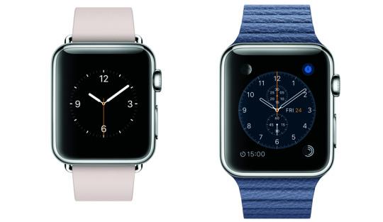
The Apple Watch is much smaller, sleeker, and more beautiful than any other smartwatch. Small is so important. It’s the difference between wearing jewelry and strapping on a little phone.
The front glass of the two higher-end models is made of sapphire, which Apple identifies as the second-hardest material on earth, second only to diamond. (Apple probably played with using diamond, but figured a $100,000 watch would be pushing it.)
For each model, furthermore, you have a choice of six watchband styles, made of plastic, leather, or metal. Some offer a choice of color. Some are technological marvels. Some cost more than the watches themselves, like the $450 Link Bracelet.
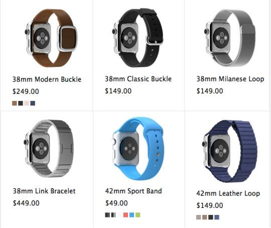
What was Apple thinking with these breath-catchingly high prices? Is it hoping to depict these as exclusive, rarefied, aspirational products? By offering a $10,000 model, is it hoping to make the $350 and $550 watches look like bargains?
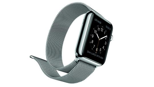
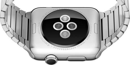
In any case, the watch and its bands are bristling with Apple-esque innovation. You can detach a band, to swap in a new one, just by pressing a button on the underside of the watch. Some of the bands have powerful magnets instead of a buckle or a clasp, which makes slipping the watch on and off delightfully easy.
* The Apple Watch answers the question, “Why?” Why would anyone want a smartwatch, if all it does is duplicate information that’s on your phone?
The Apple Watch makes clear that at least one company has put a good deal of thought into this matter. The back of the watch, for example, is filled with sensors (two LEDs and two cameras) to track your heart rate — something the phone in your pocket can’t do.
And instead of vibrating like a phone, the Apple Watch taps. When it wants your attention — an alarm, an incoming text or call — it actually taps you on the wrist. It’s the wildest, strangest thing. It’s subtle but unmissable, especially when accompanied by the silvery audible pings and chimes that designate different notifications.
Then there’s the more general answer to the “Why?” question. It’s the fact that the average person pulls out his phone 100 times a day. This watch, like all smartwatches, serves as a gatekeeper, a filter. You can glance at your wrist, discreetly and briefly, to see why your phone is trying to get your attention. When you’re in a meeting or in transit, a lot of communiqués aren’t so urgent that you have to deal with them now. With a smartwatch, you can take a peek before committing to hauling out your phone.
On that topic, Apple’s notification management is excellent. You have total control over which kinds of messages tap you on the wrist. You can choose “the same ones I’ve set up on my phone” or override those settings for the watch.
And if some call or alert starts ringing at an inopportune moment, you can shut the watch by pressing your palm against its screen, as though to say, “QUIET!” That’s handy in libraries, churches, or chess matches.
* It’s light-years more sophisticated. Apple’s third strategy for making smartwatches: making them really, really great.
The designers have obsessed over the details of this teeny-tiny operating system to an almost absurd degree. They created a new operating system that’s intended for human interactions that last only seconds. They made a new font whose letter spacing tightens as the size changes — because that’s what looks best on a tiny screen. They created animations that make information glitter and leap. On the Mickey Mouse watch face, they designed the curvature of the little rodent’s hands to match the curves of the font.
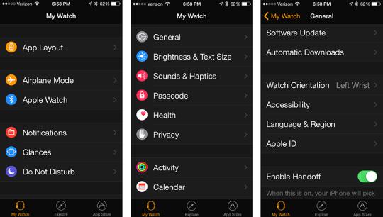
On the iPhone, you use a new Apple Watch app to adjust the watch’s brightness, type size and boldness, sound volume, wrist-tapping violence, Do Not Disturb hours, and so on. Here, too, is where you choose which music (up to two gigabytes) you want loaded onto the watch, so that you can listen when you’re away from your phone, and which photos you can see on its tiny screen. And here’s where you indicate that you intend to wear the watch upside down because you’re a lefty. Changes that you make in the app are transferred instantly to the watch — there’s no Save button.
Now, plenty of people probably care less about finesse and more about things like price. But in time, at least some percentage of that effort will make you grateful. You might not care about the cool way the bars of your fitness-goal progress grow around a circular path, but you will certainly appreciate that the Apple Watch never tells you, “Can’t open this data type; view on your phone,“ the way Android Wear watches do.
Telling the time
Most of the time, the screen of the watch is dark, to save power. When you lift your arm, it wakes quickly, showing the time. It goes dark again the instant you drop your arm.
When you’re lying down, that arm-lifting bit doesn’t always work, but you can also tap the screen to wake it up.
Unless you change the settings, the watch always wakes up showing you its watch face. You get a selection of 10 watch faces to choose from, and there are hints that someday you’ll be able to install others.
They are stunning, these watch faces.
In Solar, you see a sine wave of the sun’s progress over 24 hours; you can see where it is right now, or you can turn the digital crown to make the little sun speed through the sky to its sunrise or sunset moment.
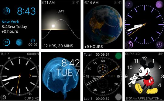
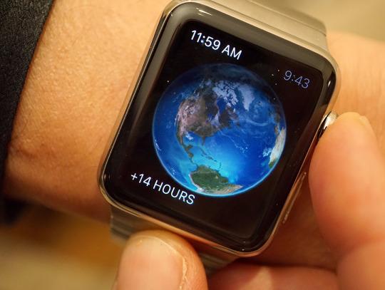
In Astronomy, you see the Earth from space, correctly illuminated as it appears at this moment. If you tap the tiny Moon icon in the corner, you fly through space, the moon looming larger as you approach, until you’re viewing it as it’s currently illuminated.
In some faces, like Chronology, Utility, Color, and Simple, you can customize the complications that appear in the four corners. (In the watch industry, a complication is actually a desirable feature. It’s information beyond time telling, like a date display or a moon calendar.) You might decide to display the sunset time, battery level, fitness goal, day/date, or stopwatch.

On some faces, you can choose to have numbers or just tick marks — and which numbers, and which tick marks. And what color you want the sweep second hand to be. And what timescale you want the Chronograph to display.

And Mickey Mouse taps his foot once a second, bopping to some little mouse tune that only he hears.
Navigation
Apple has concluded that not all the conventions it developed for the iPhone are usable on a screen this tiny. For example, scrolling with your finger means you’re blocking the screen with your own flesh. And forget about two-finger gestures. If you have only an inch to pinch, there’s no room to zoom.
So in the end, Apple has designed three different physical controls for interaction with the watch:
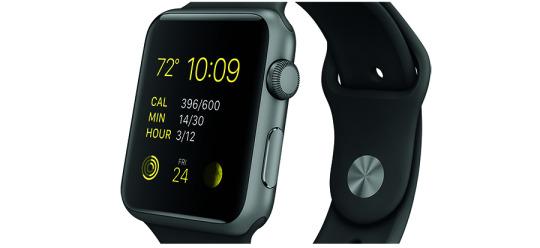
* The digital crown. You can scroll with your finger on the touchscreen. But Apple has also provided a knob on the side — a digital crown, they call it — that you can use for zooming and scrolling. It’s like the winding crown on a traditional watch, or, if you’d rather, a tiny, knurled descendant of the clickwheel on the old iPods.
You turn it when you want to zoom into a photo or map, when you want to scroll through a message or list, and when you’re choosing complications on those watch faces. Here, for example, is how your photos first appear (left) — and what you see when you’ve zoomed all the way in to one (right).
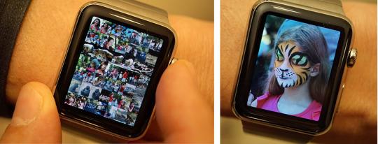
You also use the crown as a button. Clicking it once backs you out to the previous screen. Holding it in triggers Siri, which works impressively well.

The watch communicates with the iPhone over Bluetooth — and Wi-Fi, which is something Android Wear watches can only dream about. So even if your phone is out of Bluetooth range from your watch, as long as both are on the same Wi-Fi network the phone can still be the comm center for the watch.
And here’s a surprising feature that Apple hasn’t said anything about previously: When the watch is in a known Wi-Fi hotspot, the watch can perform the most essential online functions even when your phone is completely dead, turned off, or absent. It can query Siri, for example, send and receive texts, and send/receive drawings and tap patterns to other watch owners. That’s impressive.
* The side button. Below the crown, on the side of the watch, there’s a relatively jumbo metal button, which Apple wittily calls the side button. Pressing it brings up a circular display of your most-contacted contacts; turn the crown to choose one for calling or messaging (below, left).
Once you’ve selected a person, you have three options (below, center). First, you can place a call.
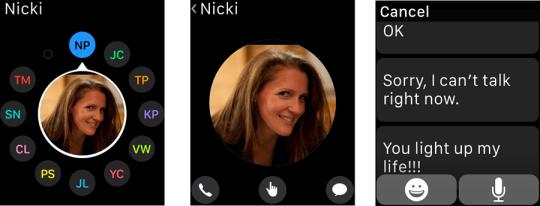
Yes, this watch has a speaker and microphone. The audio is fine in a quiet room, but hard to hear if there’s background noise. You do look a little demented talking with your wrist held up to your head. And you have to pity the state legislatures all across America that have just finished passing “no cellphones in the car” laws. Now you can make calls from your wrist. Is that breaking the law?
Second, you can send a text message. You can scroll through a list of canned messages like “OK” and “I’m on my way,” which you can send with one tap. You can customize these in the phone app — change them to say “You light up my life, wife!” or “’Sup, Daddy-O?,” for example. You can dictate a message using Siri. Apple made no attempt to add a keyboard on the watch, thank goodness.
If someone texts you with a question, by the way, the watch sometimes makes an attempt to offer the logical responses as pretyped buttons, like this:

When it works, it’s absolutely amazing.
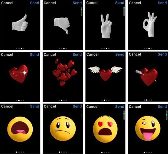
And — I swear, this will sell more Apple Watches than any other feature — you can dial up an animated emoji. This is incredibly hard to describe, but here goes:
You start with a smiley, or a heart, or a white-gloved hand. As you turn the crown, that face/heart/hand changes, moving through hundreds of frames, hundreds of variations. The face goes through every shade of human emotion; the heart sprouts wings or an arrow; the hand holds up a finger, or three, or five, or makes a fist. When you find the frame you like, you can send it to the other guy’s phone — where it will animate that frame. The hand will twitch a little, the face will nod, whatever.
Or this: If the recipient also has an Apple Watch, you can draw on your screen. A little heart, house, “forbidden” symbol, face — anything. That drawing appears instantly on the other person’s watch screen, animating as though you’re a ghost drawing it right now, from thousands of miles away.
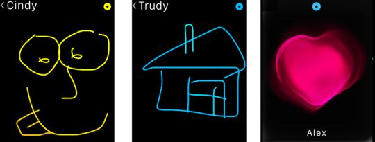
You can also send your current heartbeat, which the other person feels as thump-thump taps on the wrist, accompanied by an animated heart.
And you can send Morse code-like patterns, watch to watch. You tap your screen, and the recipient feels it on her wrist. You might, for example, have a prearranged code that means “Thinking of you” or “Coming home!” or “This party’s dead. Can we go now?”
Talk about reaching out to touch someone! These features create a long-distance intimacy that’s never been possible before. It’s really freaking cool.
Oh — and if you’ve set up Apple Pay on your phone, pressing the side button twice lets you pay with the watch if you’re in a shop or restaurant that has the right kind of wireless terminal.
(And what’s to stop a bad guy from stealing your watch, and thereby buying stuff on your Apple Pay account? Easy: The instant the watch comes off your wrist, it requires a password before you can use it again. Nice.)
* The touchscreen. You tap buttons and icons on the screen. You can also force-press things, which means tapping hard. Clever, really, and also new in the tech world — on some devices you can long-press, but that’s for people with time on their hands.
Force-pressing is like right-clicking: it opens up additional options, like the Flag, Unread, and Trash buttons for an email message you’re reading.
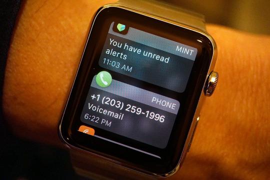
There’s a lot of swiping, too. From the main clock screen, you swipe down to view all the notifications that have piled up — messages, calls, email, Facebook, Twitter, and so on.
You swipe up to view a sideways-scrolling parade of what Apple calls Glances. These are single-screen dashboards for other apps on the watch: Stocks, Weather, Fitness, Battery Life, Twitter, World Clock, your next Calendar appointment, where you are on the Map, and so on. You can tap one of these glances to open the corresponding app.
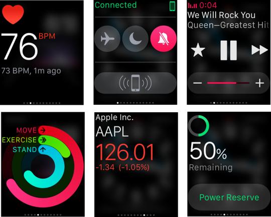
The truth is, navigation is a big watch weakness. There aren’t any visual clues that more options are waiting if you force-press, or that anything will happen when you turn the knob. You eventually learn, but only by trial and error. And every time you force-press or turn the knob and nothing happens, you feel like a dolt.
Apps
Yes, there is an app store, and there are preinstalled apps on this watch. If you press the crown clicker enough times, you wind up at the launcher screen, which looks like this:
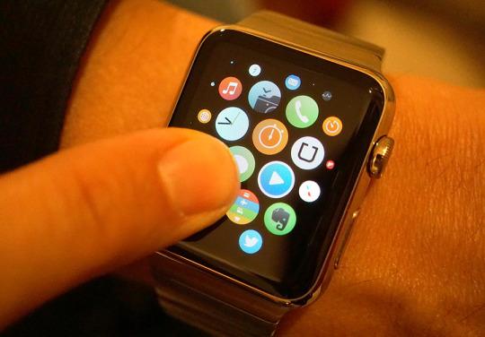
It’s very cool-looking — you drag your finger around to shift this display, fluidly and easily, and you can organize the icons just the way you can on the iPhone’s Home screens.
But it’s hard to believe that whoever designed this was the same person who lost sleep over Mickey Mouse’s finger curvature. How on earth are you supposed to know what those microscopic icons are?There are no labels, and the icons themselves are about the size of carbon molecules.
Again, you learn in time. But picking out an app is not nearly as fluid on the watch as its other features.
So what are these apps? Here are some of the best:
* Maps. As you drive, your watch is a tiny GPS screen. (The watch doesn’t have GPS of its own, but your phone does.) When it’s time to make a turn, the watch taps you twice on the wrist and displays a big arrow. It’s fantastic.
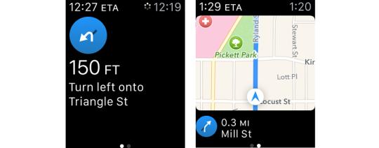
If only it could work with the phone’s Google Maps app instead of the still-hobbled Apple Maps app!
* Camera. The watch can be a remote screen for your phone’s camera, complete with a shutter button and a three-second-delay shutter button (below, left). That means that, for the first time, you can use the good, high-resolution camera on the back of your phone for selfies, instead of the crummy one on the front; you use the watch to frame up the shot.
That also bodes well for anyone who wants to capture interesting angles — put the phone in the crook of a tree, for example — or anyone who’s a spy.

* Passbook. Once you’ve stored your boarding pass in the iPhone’s Passbook app, you can access it and display its barcode, for the TSA’s benefit at the airport, right on the watch (above). Yes, I tried it. Yes, it was awesome. Yes, I got looks from people.
* Remote. You can control your phone’s music playback from one of the Glances (play, pause, skip). But the Remote app lets you control your computer’s iTunes playback, or navigate an Apple TV.
* Mail. You can read, delete, and flag messages on the watch, but you can’t compose new ones or reply.
* Workout. Health tracking is a huge, beautifully implemented aspect of the watch. All day long, the watch watches. It generally tracks three statistics: how much time you’ve spent moving (i.e., not sitting); how much time you’ve spent exercising (moved more vigorously — for example, a brisk walk); and how many times you’ve stood up from your sedentary position.
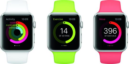
At your option, it can suggest that you get up and walk around for a minute after each hour you’ve spent rotting in a chair.

The graph of your progress is available in a Glance, on some of the watch faces, and on the iPhone in a corresponding Activity app. It also shows up in the iPhone’s Health app, which you can use to further slice and dice your fitness graphs.
There’s also a separate Workout app on the watch. It offers buttons for various workouts: Outdoor Walk, Outdoor Run, Indoor Walk, Outdoor Cycle, Elliptical, Rower, Stair Stepper, and so on.

During a workout, the watch tracks your heart rate continuously — sometimes you can even see the eerie green light from the sensor spilling out on your wrist. (The rest of the day, it checks your heart rate every 10 seconds.) It uses the other sensors from the watch and the phone to track as much as it can about your workout.
Now, even if you leave your phone at home, the watch can track your runs. But it doesn’t have its own GPS, so how is that possible?
Get this: The watch’s motion sensor (accelerometer) knows every time you take a step, but it doesn’t know how far that step has taken you. But if you start out your watch ownership by going for a run withyour phone, which does have GPS, the watch correlates your number of steps (and frequency) with the distance you’re covering.
In other words, the watch soon learns how much distance you cover with each footstep — it even differentiates between quicker footsteps and slower ones. Thereafter, it can calculate the distance you’ve run all by itself. That is slick.
And, of course, while you’re out running, you’re listening to music on Bluetooth headphones. Without your phone.
And now the bad news
According to Apple, the watch’s battery runs about 18 hours on a charge. In typical Apple fashion, that’s being modest; in two different tests, I tried to see how long it could go without a nightly charging. Both times, it lasted well into the afternoon of the second day — more than 24 hours.
And when your Apple Watch does approach the end of its battery power, it enters a Power Reserve mode with no functions except timekeeping — it’ll go another week like that.
But Apple is right about one thing: You’ll have to charge this thing every night.
It’s made that as easy as possible, especially if you have one of the bands with magnetic clasps that aren’t fussy to remove. The charger is a sweet magnetic disc that snaps automatically onto the back of the watch and charges it via induction — you don’t have to align it any particular way. And the cord is 6 feet long, so it’ll reach from your bedside table to a power outlet near the floor.
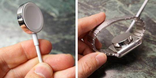
This means, however, that you won’t be wearing the watch at night. That’s a much bigger problem than anybody seems to be acknowledging.
For one thing, that fact makes the Apple Watch the only fitness tracker on the market that can’t track your sleep. One of the great joys of the Up band, Fitbit, and other bands is that they track not just your steps, but also your cycles of deep and light sleep. Not the watch. For a device so thoroughly designed to help monitor your physical well-being, that omission is a heartbreaker.
And if the watch is on your nightstand, you can’t exploit its brilliant wrist-tapping feature as a silent alarm that won’t wake your partner.
Finally — forgive me for bringing this up — when you wake up to pee in the middle of the night, you can’t check your wrist to see what time it is.
This is not, of course, entirely Apple’s problem; no full-color smartwatch lasts more than a day. (The upcoming Pebble Time is supposed to have a seven-day battery, but its color display is based on e-paper technology, which shows only a few colors and can’t animate like Apple’s more traditional display.) Battery technology simply isn’t available to drive a full-blown computer for very long in so little space.
But man, what a bummer.
The state of the watch
I hear it all the time: “Why do I need this thing?”
You could argue that the Apple Watch helps to streamline your consciousness. Once you’ve customized who and what is allowed to tap your wrist to get your attention, it truly does help to filter out the noise of the world that tries to reach you through your phone.
The hands-free speakerphone thing in the car, the fitness tracking, the Apple Pay business — those are all welcome grace notes to life, too.
And this much is unassailable: The Apple Watch is light-years better than any of the feeble, clunky efforts that have come before it. The screen is nicer, the software is refined and bug-free, the body is real jewelry. First-time technologies await at every turn: magnetic bands, push-to-release straps, wrist-to-wrist drawings or Morse codes, force pressing, credit card payments from the wrist. And the symbiosis with the iPhone is graceful, out of your way, and intelligent.
But the true answer to that question is this: You don’t need one. Nobody needs a smartwatch. After all, it’s something else to buy, care for, charge every night. It’s another cable to pack and track. Your phone already serves most of its purposes. With the battery-life situation as it is, technology is just barely in place to make such a device usable at all.
In the end, therefore, the Apple Watch is, above all, a satisfying indulgence. It’s a luxury. You might buy it to bring you pleasure — and it will — much the way you might buy a really nice car, some really nice clothes, or a really nice entrée.
Or a really nice watch.
Apple will take preorders for the watch beginning April 10. Deliveries start on April 24.
Source: Yahoo News


